Creating stylized art inspired by Ghibli using Unreal Engine 4
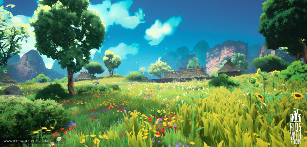
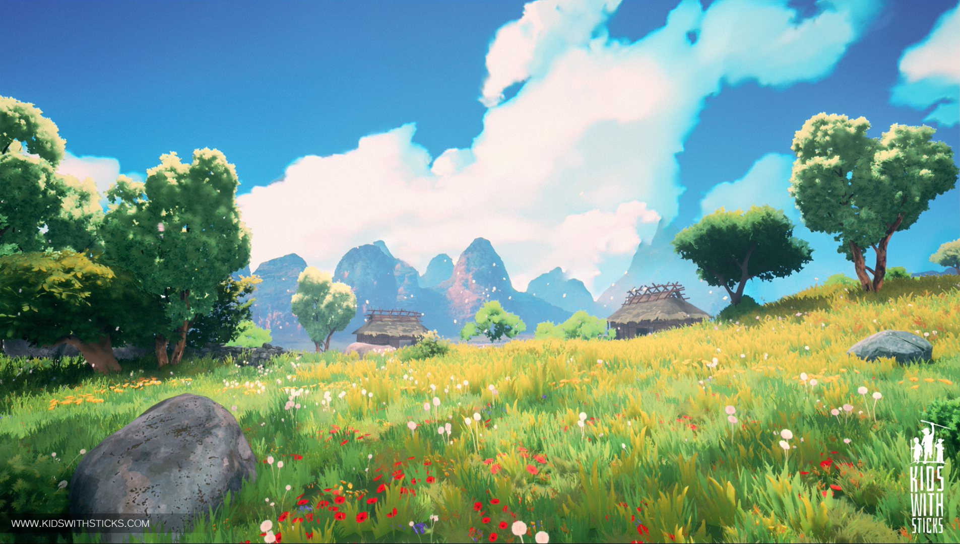
As different game developers around the world draw inspiration from various art styles, so do we. In our appreciation of Studio Ghibli ’s artworks, we decided to create a game that will evoke its visual atmosphere.
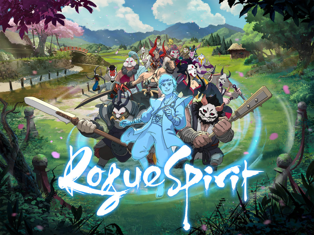
First of all, we have been thrilled to see such enthusiastic reception of our last twitter post. We read all your comments and readjust our vision with regard to your feedback! Many thanks for your support, it means a lot!

Each game project undergoes a pre-production stage in which we attempt to define a game scope and ascertain that we are able to develop game USPs. We will keep you updated on the progression of the game pre-production in dedicated posts. Now, let’s talk a bit more about the core inspiration for our game–Studio Ghibli’s artstyle.
Why it’s so hard to recreate 2D in 3D world
One of the challenges that we encountered when working on this aspect of the game was transferring hand-painted backgrounds onto 3D environment. Animating paintbrush strokes on objects is not terribly difficult, unlike harmonizing their motion with the player’s viewpoint. Another challenge was their optimization. This is why we decided to significantly simplify objects, textures, and materials, so that the image also includes elements that don’t need to be painted.
Our priority was to evoke the general feeling and atmosphere akin to Studio Ghibli’s artworks.
Ghibli style – analysis
We are very well aware of the complexity of Ghibli’s art and thus needed to acknowledge the limitation of the framework we have at our disposal as game developers. Naturally, we cannot share too many details about the crucial elements of our game yet, but let us explain our approach through the analysis of our interpretation of Ghibli’s art style.
We spent several weeks testing different textures, post-processing, researching movies and other stylized games, and after some deliberation we were certain that we want Ghibli style in our game.
- This means textures that are simplified in a painterly, but not cartoonish, way.
- Careful selection of colors that inspire certain emotions and are determined by the frames from the film.
- Layers of vegetation, painted with a blur and scarce details (unless the element plays an important role in biom/frame/POI, etc.).
- The sky and backgrounds being of crucial importance in terms of creating the character and the atmosphere of the fictional world.
- Mutable environments; the physical world is responsive to and transformed by our actions. In other words, the world reacts to us.
- Ghibli movies are known to utilize elements both from Eastern and Western cultures and thus reach wide global audiences. We also strive for similar diversity, which will aid us to explain the world, e.g. we might use urban planning of a medieval European city and mix it with the elements of Eastern architecture and artifacts.
- The use of colors in Ghibli movies is consistent; night and day frames often share the same color palette, and the range of colors changes depending on the emotion they are intended to incite.
- Stone materials: Ghibli uses many flat surfaces. These are often loosely painted with distinctive brush strokes, and for large stones the visible detail is treated with great care, mapping all the roughness of their surface, but not in the way that would take attention away from the overall silhouettes of the stones. Textures don’t dominate the form, but rather complement and diversify it.
- Tree materials: Tree trunks in the background are usually painted lightly with one or two colors and slight detail on the bark. They are braided or suede. The second material on the vertex paint should be the basis for extraction of detail. In turn, the trunks of large trees in the foreground are intricately detailed, stratified, but brush strokes used on them are still distinctive and there’s also some simplification of shapes.
Similarly to Ghibli’s strategies, we also focused on color palettes to evoke certain emotions that will later on define the biomes:
- magic and the unknown:

- imagination and freedom

- adventure

- danger

- revival and renewal

Lighting
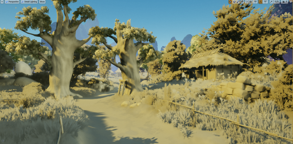
Our game requires fully dynamic lights, so our test has been created without any baked lighting.
We’ve been using only movable SkyLight with DFAO enabled and Directional Light with Distance Field Shadows.
Basically, Distance Fields are the foundation of our lighting.
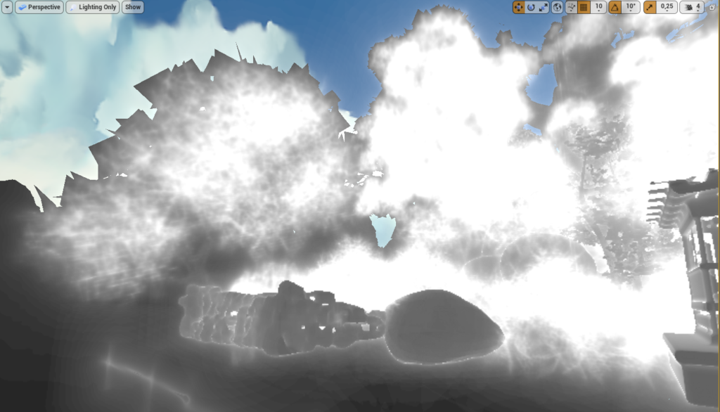
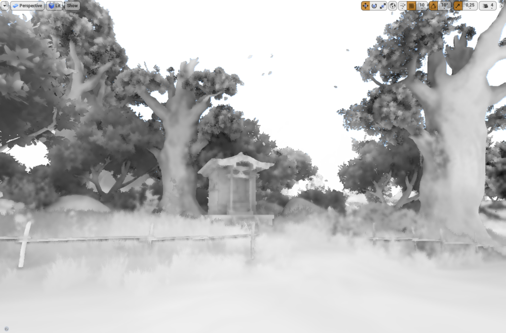
Lighting is fairly simple and most of the sceneries rely on other visual elements designed by our graphic artists: geometry, textures, composition, etc.
The cool thing about Distance Fields is that you can use them in materials and niagara which is extremely helpful.
Foliage
Since we needed more exposure to stylized graphics, we began with watching Studio Ghibli’s classics like My Neighbor Totoro, Princess Mononoke, Grave of the Fireflies, Nausicaa from Valley of Wind, Spirited Away, etc. From these animated movies we picked our reference images and elements that we used later when creating 3D sceneries. In short, we did our research, came up with the concept for the scenery and plunged into work.
Foliage is never easy to replicate. We approached this challenge by first browsing the Internet for some useful tips and solutions we might need further on the way. The article that turned out to be the most helpful was (not the most recent and yet so fresh) publication from Simon Trumpler: https://simonschreibt.de/gat/airborn-trees/ in which he explains how to build meshes specially designed for foliage. The most important part for us was the instructions on modifying of normal verecies created from sphere plains. Another extremely helpful article was authored by Dragos Matkovsky: https://www.matkovskidragos.com/ It’s a goldmine of information about stylized nature. Finally, the publication from 80.lv https://80.lv/articles/stylized-nature-vegetation-animation-shaders/ from which we took inspiration for creating and animating simplified textures.
Below you will find an overview of the work we have done so far.
Bushes & Trees
a ) Texture created by hand in Photoshop. We applied simple division for leaf textures in order to have easy access to changes and iteration of it in the future.
b) Having designed the texture, we made some simple meshes in blender to go with it. For now these are simple mapped plains.
c) Next step was creating larger meshes from which later on we would build trees or bushes, and if we set UVs properly, we can reuse them later on.
d) After that it was time to use DataTransfer modifier for proper shading.
It’s important to check Auto Smooth option in Blender; without it custom normals won’t work.
e) After applying modifier, we could begin to assemble final tree or bush. It’s good to work on duplicates to always have a backup 🙂
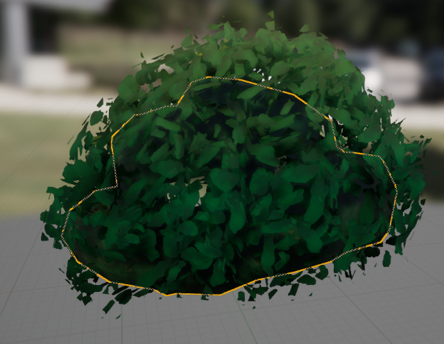
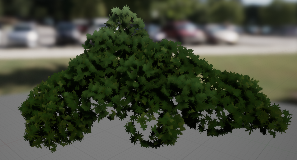

Materials
After creating basic material for foliage, our meshes didn’t come out as expected (did not quite look like the ones in the tutorials/articles). It seemed that the custom vertex normal wasn’t the only problem. We needed to shade geometry accurately.
Simplifying leaves shape – more often than not we don’t need leaves that are realistic looking. In some cases they were even interfering with the overall “look and feel” of stylized graphics. Simplifying them allowed us to achieve this more “painterly look”.
It seems that the problem resulted from our use of custom normal which was supposed to help us 🙂
After some time looking for a solution to this issue we found it here
https://forums.unrealengine.com/development-discussion/rendering/1560181-two-sided-material-with-custom-vertex-normals
We used highlight height mask to change colors of bushes and trees. Later this can be changed to directional light direction to enforce lighting.
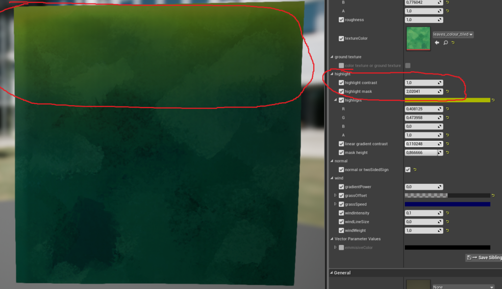
This generates more color variation on trees and vegetation.
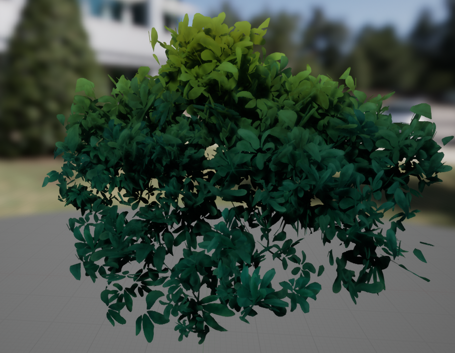
For props we used only Base Color and Normal Map.
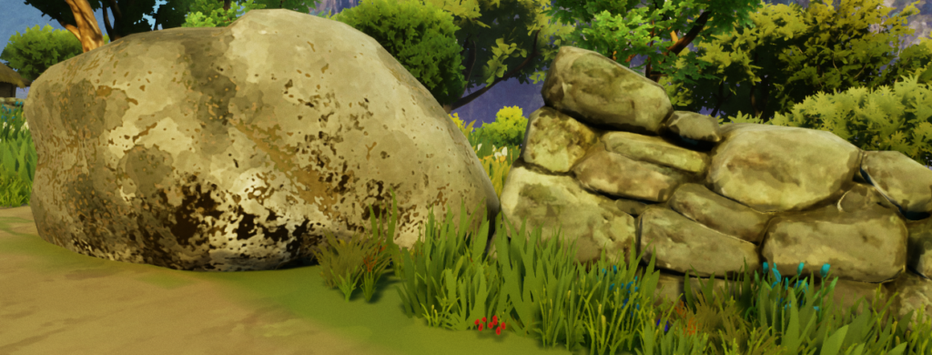
At this stage it was crucial for us to be able to create stylized textures. We tried to use Coat3d but eventually decided to stick with Photoshop and Substance Designer.
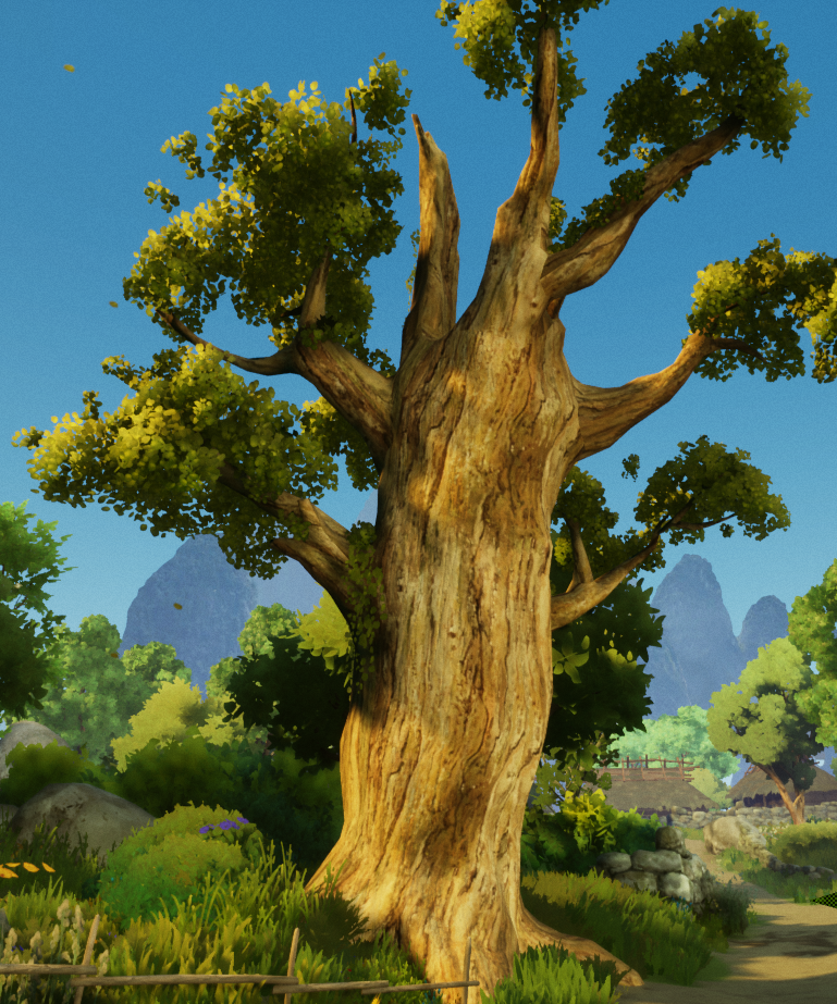
Trees were harder, as they tend to have complicated geometry in Ghibli’s animations.
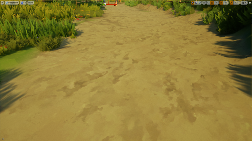
Terrain is using tileable textures which are just blended between, as in normal landscape. Again – the artists are in charge of delivering the final quality here.
Backgrounds
We used painted landscapes in 2D, imposed on 3D objects, as backgrounds. The process of creating backgrounds will be further refined. We want to give the players the feeling that the world surrounding them is vast and coherent when passing through new locations. When creating backgrounds, we want to be as close to the animated movie pipelines as possible, especially to these used by Studio Ghibli’s Kazua Oga and Osamu Masuyama.
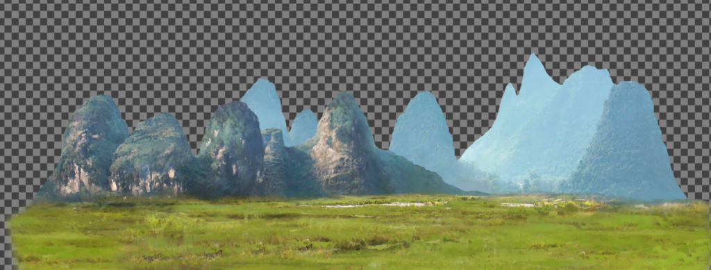
Sky
Currently, we animate the sky globally on a sphere with a tiling sky texture that rotates around the middle of the level . It’s animated using simple material. Ultimately, each cloud will be animated separately from the material level to get the impression of layered overlapping clouds and make the sky look more dynamic.
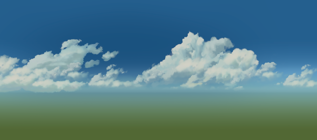
Post-process
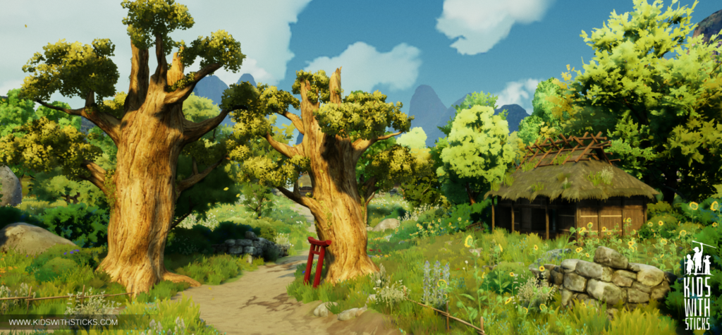
We had to do some post-process at the end. In general everything looked “okay” at first glance. After revisiting the results of our work and the desired results we were aiming for, we compared our 3D scenery with screen scraps from Ghibli movies. We noticed some differences in values and colors, which we later adjusted to reach this Ghibliesque look and feel.
Conclusions
We believe that it is crucial to combine art with technology in order to create stylized visuals. It cannot be achieved without graphic artists who know how to create stylized textures and models. Equally important is the knowledge of materials and lighting in UE4.
Next Milestones
Major part of Ghibli art style is coming from dynamics objects as characters, animations and particles. That’s our next milestone.
PS. This is only an art test. Our game will have more style variety and will be much more polished in the future!

16 Responses
Congratulations for one amazing post! Indeed your art style is beautiful, and I truly love the level of detail you guys went into describing your team’s ideas and observations, and not only the usual technical aspects but also things in an artistic level, like the analisys on mood for palette colors and shading elements in your vegetation textures. Hopefully this will help more stylized games in the future not to shy away from using real time lighting!
My team is also developing a game inspired by japanese animation, using Makoto Shinkai’s aesthetics as base for our work. We were having issues with the shading of trees, and your observations on Transposed Normals and Highlight Height Masking might be a hint on the right direction, so thank you very much for this post!
Ryrumeli we are glad we could help in anyway 🙂 We want to spread even more knowledge along the way !
Where’s a demo? I would kill to playtest even this techdemo.
That is so beatiful. Thank’s for your work and this article, it’s really great.
Awesome post! Keep up the great work! 🙂
Beautiful work, a question which method do you use to organize the planes of the sheets in the desired way? I have some time trying to recreate that method, but I don’t achieve the results.
[…] are some really close adaptations, basically emulating the style exactly, like here, here, and here. Some shift a towards more ‘modern’ games aesthetics by incorporating PBR materials and […]
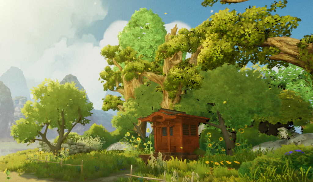
You guys were linked in a CGSociety post and when I saw the art that you guys did (the one with the road that had trees, a shrine and a temple), my heart quivered. Like, damn. Everything was breathtaking. The details, the lighting, the shadowing. It shook me to the core. I’ve honestly no idea why, but I feel that it hit really close to how I imagined a forest, a road, a life, would be. From someone who had escapist tendencies and resorted to novels/anime/games in my dark past, it resonated with me deeply.
I’m honestly fucking awed.
You guys rock.
Thank you so much for your work and I sincerely hope everything turns out for the best.
Attractive section of content. I just stumbled upon your web site and in accession capital to assert that I get in fact enjoyed account your blog posts. Anyway I’ll be subscribing to your augment and even I achievement you access consistently quickly.
I’m truly enjoying the design and layout of your blog.
It’s a very easy on the eyes which makes it much more enjoyable for me to come here and
visit more often. Did you hire out a developer to create your theme?
Exceptional work!
This post is genuinely a nice one it assists new the web
visitors, who are wishing in favor of blogging.
Right here is the right site for anybody who hopes to understand this topic.
You understand so much its almost tough to argue with you (not that I actually would want
to…HaHa). You certainly put a brand new spin on a topic that has been written about for ages.
Great stuff, just wonderful!
Im obliged for the post. Great.
Hey, thanks for the post. Much obliged.
[…] Source: Creating stylized art inspired by Ghibli using Unreal Engine 4 – Kids With Sticks […]
This is awesome ! Thank you so much for taking the time to share your whole process.
Very inspiring, I just want to try it out now 🙂